Web Design/ Front Dev Jean Le Bellego, Sound Designer
By the end of last year, I was lucky enough to be asked to design and code the website for Jean Le Bellego, a young and talented sound designer.
Some years ago I've created a visual Curriculum Vitae for Jean. Knowing his style of music, I've opted for a technical, futuristic look over dark background.

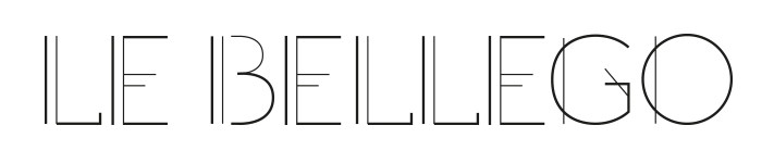
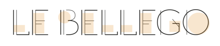
At the time, I was playing with typography and I decided to use one of my “tests” on the CV.
From these “art déco” style types, I've extracted the geometric forms that composed the types and I used them to “write” Jean's last name in the header.
The creation of the logo followed the same basis: I've used Jean's initials —JLB — to form a friendly, easily memorable logo:
I like the way his initials came out to invoke a shy, smiling face.

The design process of the site was very interesting also, as I could find out how close Jean's work as sound designer is analogous with the work of a graphical, visual one. He understands very well my questions and doubts, and he was able to answer them in a very straightforward manner. This kind of objectivity lacks sometimes in our work with clients who often struggle to clearly express their wishes in terms of identity and design.

In some way, Jean challenged my creative process, making me look for alternatives there where I usually don't.
To begin the creative process, I've created some static mockups to discuss with Jean, but quickly I've started to design directly on the browser, where I feel more comfortable and at ease to create.
All the design rest in a svg spiral representing sound waves; the spiral not only illustrates the sound design, but also creates a reading dynamic to the home page.
The Typography
The choice of the font families was somewhat tricky. I went straight away to a more technical type, following what I did for his CV, but Jean was looking for a more friendly, fresh voice.
Together we tested several font families and we finally chose the beautifully crafted Afacad that, curiously, has an “art déco” touch in its uppercase glyphs.
Afacad has an elegant, jazzy side, and yet it is young and friendly.