
There's No Place Like the Browser
While I love my work as a web designer and the way I design for the web, I struggle everyday with the way others think I have to design. It amazes me to think that it’s the web’s 36th anniversary this year, and designers still think about the web as a static, lifeless page.
I don't want your Figma, which I dislike almost as much as I hate AI. First, because I find Figma's interface clumsy and unpleasant; second because it is so limited in terms of web design it is infuriating. Actually, this goes to any other graphic tool that is not my browser. Yes, I design on the browser, and that's why I love my work as a web designer. But this will be another post; here we'll cover the reasons why it is so counter-productive to use static designs for the web, today more than ever.
Responsive Design
Responsive design is possible since maybe 2011? 2012? Back then, it was really a small revolution on web design, as we finally could totally embrace the multi-device nature of the web.
Alas, instead of properly adopting a new way of work, most web designers just added one more step to their work process: the “mobile view”; of course, arbitrarily choosing the width of this “view”. What does the layout and the design of the intermediary sizes matter after all?
We started hearing about empty terms like “tablet views”, breakpoints, etc. But nothing really changed. Oh, of course we design with the “desktop view” in mind first; “Mobile first” always seemed to be only a beautiful, intangible concept.
Maybe you believe you are not one of those designers, and I'm so happy if that's true! But what I see all around me is that most designers simply miss the opportunity to make their work more challenging and interesting, and that they're still designing as if it was 2010.
Today, more than 12 years later, it seems that responsiveness is just a vague notion for designers, especially the young ones, and a “mobile view” mock-up will be considered only if explicitly demanded by the clients.
I believe that, if there were one single reason to abandon static mock-ups for the web, it would be responsive design, and that is nothing of a “new trend.”
Limiting Creativity
When working with static mock-ups, the idea of intermediary widths, content/layout transformations, art direction, etc., are never considered; yet, the front web is getting increasingly rich and powerful. The latest CSS features are turning web design into a thrilling work of creativity!
Grids, sub-grids, view transitions, scroll-driven animations, responsive font sizes, to name a few; you can spend most of your time just testing new ways to design for the web, and yet, designers stuck with tools like Figma don't have the slightest idea of what they are missing and how these tools are holding their creativity back.
The full web-user experience can never be achieved with such tools, even if you create an “interactive” mock-up, that will only mimic some pointless interactions in a fixed width screen.
That points us to a question: who will be the one bringing the advantages of the latest web technologies to our designs if not the web designer?
Who will be the one bringing the advantages of the latest web technologies to our designs if not the web designer?
What You See Is Not What You Get
I get really sad when I see young designers designing for the web. First, as we've seen, they don't exploit the web technologies and possibilities available to them as much as they could; second, they see their work as a “pixel-perfect” screen. And here I wonder: will we ever get rid of this?
Visual designers love to create that flawless static mock-up, where all the text is carefully calculated to create a perfectly balanced design, with false alignments and dimensions, and they never foresee what may happen to their design if this scenery is not respected. Because they don't know the capabilities of the web, how can they understand why their pixel-perfect screen is broken when online? Should we leave to developers the process of thinking how to deal with it after? Is it really up to the front developer to guess how content should flow, or how blocks should align in every case/device size?
That points us to another question: who will be the one deciding how the unexpected should be dealt with, if not the web designer?
Calculated Useless Tasks
Another point that drives me crazy is the way we uselessly throw away our time with tools like Figma.
Apparently, the "thing" with Figma is that it somehow became the “design reference source”. In a project, people use Figma as the de facto documentation for design. They even offer a “developer's mode” — don't bother if all font sizes and dimensions are in pixels! Here I'm not talking only about the style-guide or UI kit, but also about each and every screen your application may show up.
That means that those flying screens will not only be the starting point for development, but also the only real source throughout the project, including textual/editorial content.
Each small change, each small evolution must be reflected in those scattered screens, for which some poor designer will have to spend their time editing Figma, instead of doing what they’re supposed to: designing.
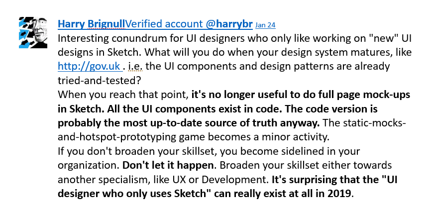
As Harry Brignull points out — back in 2019!! —, after a while, what do we have? After development starts we'll have a double source of reference: one in Sketch, one in dev, with all the problems of synchronicity and redondancy this situation may cause.
Okay. Let's say we don't do that; only the so called “UI Kit” is done and used as a reference in Sketch, or Figma, or... Well, I find it ludicrous, for example, when I see all the button styles, on each and every type and state, frozen in a huge, loosely floating frame, when we already have everything we need in HTML and CSS.
We may add to that a layer of ZeroHeight, where we're going to properly describe and document our UI kit; and now we have three sources of reference — yes, we may “connect” Figma to ZeroHeight, but that doesn't reduce the number of sources or the redondancy.
Now we have a project with three different sources of reference, depending on two different third-party tools. It should be ok, if we don't think about enshittification.
It is curious how we are always making the same mistakes: one step forward, three steps backward. People rather trust AI, a technology that is accelerating climate change and literally exploiting everybody, instead of recognizing the extraordinary advantages of a free, unique technology as the web.
Conclusion
A web page is not a static graphic element such as the page of a magazine, a poster or a PDF file. We can interact with it, and its content reacts, flows, and adapts smoothly. The web design must be able to reflect this specificity and make the most of the unique capabilities of the web.
It is more than time to rethink the web design process.
A static mock-up of a web page does not reproduce the interactive and fluid aspect of the web, nor does it translate the specific display characteristics of the various screens, browsers or systems.
The perfect static display does not exist on the worldwide web: a design can be displayed exactly as intended in a certain browser and can be disgracefully degraded in an older version of another browser. “Pixel perfect” is an expression that should have died many years ago.
I strongly believe that the web design must be presented to the client as quickly as possible in its most relevant form, i.e. on the browser.
More than the appreciation, the experience of web design under “real conditions” is essential to convey to the customer the atmosphere, tone and spirit of the site as it will be perceived by its end users.
Stay tuned: in my next post, I'll present a web design process I've tested in five different projects and the outcomes and advantages of it.